






















Why Does the Same Website Look Different in Elementor, Gutenberg and the Browser?
Pratyksh Sharma
September 17, 2026
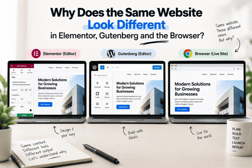
You make an edit in Elementor. It looks exactly right — spacing clean, fonts correct, everything lined up the way you intended. You hit update, open the live site in a new tab, and something’s off. A section is tighter than it should be. The heading font looks like a fallback instead of your brand typeface. On mobile, two elements are overlapping that were perfectly stacked a second ago in the editor.
It’s one of the most common frustrations we hear from clients who manage their own WordPress content, and the instinct is usually to assume the page builder is buggy or unreliable. Almost always, it isn’t. What’s actually happening is that the editor and the live browser aren’t rendering the page through exactly the same process — and once you understand why, the mismatches stop feeling random and start being genuinely easy to diagnose.
The Editor Isn’t Actually the Browser
This is the core thing to understand: whether you’re using Elementor or the Gutenberg block editor, what you’re looking at while editing is a simulated preview, not the final production page. It’s built to look as close as possible to the real output, but it’s rendered inside WordPress’s admin environment, which loads things differently than a visitor’s browser does.
Both editors run inside an iframe or a constrained preview context within wp-admin. That environment loads your theme’s styles and scripts, but it also loads the editor’s own interface styles on top — padding for drag handles, selection outlines, editing controls — and depending on how cleanly your theme and plugins are coded, those two layers don’t always interact identically to how they would on a real page with none of that editing chrome present.
Caching adds another layer of confusion. If your live site runs through a caching plugin or a CDN, visitors — and you, if you’re not logged in — may be looking at a cached version of the page that hasn’t caught up to your latest edit yet. The editor, by contrast, always shows the current, uncached state. A lot of “the editor is wrong” moments are actually just a cache that hasn’t cleared.
Gutenberg and Elementor Handle This Differently
The two most common editors don’t diverge from the live site in exactly the same way, because they’re built on different philosophies.
Gutenberg, the native block editor, has gotten steadily closer to matching real frontend output over the years, particularly on themes built around theme.json and native block styles — it pulls a lot of its preview styling directly from the same source the frontend uses. Where it still diverges is usually with custom blocks or plugins that ship their own editor-specific stylesheet, which can render slightly differently than the plugin’s actual frontend CSS, especially if that plugin hasn’t kept both in sync through updates.
Elementor works differently under the hood. It generates its own CSS for each widget and manages global styling — fonts, colors, spacing presets — through its own design system layered on top of your theme, rather than pulling directly from it. This gives a lot of design flexibility, but it also means the editor’s preview and your theme’s actual production styles are technically two separate systems trying to agree with each other. Most of the time they do, cleanly. Where they don’t, it’s often because a theme applies its own CSS to an element after Elementor’s styles load on the frontend — something that doesn’t happen the same way inside the editor’s preview context.
Font rendering is a particularly common flashpoint. If a custom font is enqueued only for the live frontend, rather than registered through Elementor’s own font management, the editor can fall back to a default system font in preview while the actual site displays correctly — or, less often, the reverse. It looks alarming, but it’s almost always a loading-order issue rather than a real styling problem.
Why Mobile Preview Doesn’t Always Match a Real Phone
This is another frequent source of confusion. Both editors simulate mobile and tablet views by shrinking the preview iframe to an approximate width, rather than rendering on an actual device. That’s a reasonable approximation most of the time, but it can miss real-world behavior — a genuine phone browser applies its own default styles, real touch-target sizing, and actual CSS media queries, which can behave slightly differently than a scaled-down desktop preview pretending to be narrow.
If custom breakpoints have been set differently between your theme’s CSS and the page builder’s own responsive settings, this gap widens. An element that looked stacked correctly at the editor’s simulated tablet width might sit right at an awkward breakpoint boundary on an actual device and behave differently than expected.
Plugin and Theme Conflicts Are a Quieter Culprit
When multiple plugins are adding their own CSS to a page — which is normal on most real sites — there’s always some risk of specificity conflicts, where one plugin’s styles unintentionally override another’s depending purely on the order they happen to load in. This can behave one way inside the editor’s preview environment and a different way once the full page assembles on the live frontend, particularly if a caching or optimization plugin is combining and minifying CSS files in a way that changes their effective load order.
We’ve traced more than one “random” styling bug on a client site back to a completely unrelated plugin adding a broad CSS rule — something targeting all buttons, for instance — that happened to also catch elements the page builder was separately styling, creating an inconsistency that only showed up in specific browsers or specific pages, not universally.
How to Actually Debug It When It Happens
The first move, before assuming anything is broken, is to clear every layer of cache — site-level caching plugin, any CDN, and your own browser cache — and reload the live page in an incognito or private window. This alone resolves a large share of apparent mismatches, since it rules out both stale cached output and any editor-only styles that sometimes display to logged-in users but never appear to actual visitors.
From there, browser developer tools are the most reliable way to actually see what’s happening — inspecting the specific element on the live page shows you exactly which CSS rules are being applied and, often, which one is unexpectedly overriding another. It’s worth checking your page builder’s own preview mode as well, rather than judging purely from the raw editing view, since preview mode is generally a closer approximation of real output than the active editing interface itself.
Global settings are worth checking specifically, since they’re a common root cause — a mismatch between your theme’s customizer settings and your page builder’s own global fonts or color palette can create subtle inconsistencies that show up unpredictably across different sections of a site. And if custom CSS has been added anywhere, it’s worth confirming it’s been added somewhere that loads consistently across the whole site — a child theme’s stylesheet or a proper global custom CSS field — rather than as one-off inline snippets scattered across individual pages, which are a common source of “it works here but not there.”
This Isn’t a Reason to Distrust Page Builders
It’s worth saying clearly: none of this reflects a fundamental flaw in Elementor, Gutenberg, or page builders generally. It’s simply how rendering an editable preview inside an admin environment works — there will always be some degree of separation between “what the editor approximates” and “what a real browser renders,” because they’re genuinely different rendering contexts trying to stay in sync with each other.
What actually determines whether this becomes a recurring headache is how the site was originally built. A site put together carelessly — inconsistent global settings, custom fonts loaded haphazardly, CSS specificity nobody accounted for — will keep surfacing these mismatches indefinitely. A site built with attention to how the editor and the live frontend need to agree with each other tends to have this sorted out once, properly, at build time, rather than becoming a recurring source of confusion every time someone makes an edit.
Building It Right the First Time
At Infyras, having spent years deep in Elementor specifically — including building custom widgets rather than relying purely on third-party add-ons, and converting Figma designs directly into production builds — this is exactly the kind of discrepancy we account for during development, not something we discover after handoff. That means checking real preview mode against the actual live output at each stage, making sure global styles and fonts are set up consistently in one place rather than fighting each other, and testing on real devices rather than trusting a simulated mobile preview alone.
The gap between editor and browser is a normal, explainable part of how these tools work. It only becomes a genuine problem when nobody accounted for it while the site was being built.
Let’s build your next project
Tell us about your idea and we'll get back within 24 hours.


Hi, I’m Pratyksh Sharma, the CEO and Founder of Infyras. Don’t hesitate to reach out to me anytime – I’m here to answer all your questions!
Your next idea Let’s make it happen.
From insights to inspiration, we create digital solutions that turn ideas into results. Have a project in mind? Let’s build something that moves your business forward.